
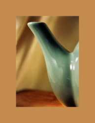
Click image for larger view
Selections->Select All. Selections->Save to Alpha Channel, you can accept the default name. Selections->Select None.
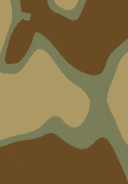
Method 1: Duplicate the image, Window->Duplicate. On the duplicate, Effects->Blur->Gaussian Blur, use a value between 5 and 20. You want to blur the image so that only color is visible, you don't need any discernible shapes. Use the Proof button to decide how much to blur, you also don't want it so blurred that the whole thing is one color.
On the duplicate, use the Eyedropper
Click on the foreground swatch to pull up the color picker, jot down the HSL values. Click on the background swatch, change it's Lightness value to match what you've jotted down from the other color.
Click image for larger view
Retrieve image dimensions, Image->Image Information.
Divide the width of the image by 4, you can round this number to something easier to work with (62 down to 60, etc.)
Image->Add Borders, "Symmetric" checked. Enter the number you came up with.

Click image for larger view
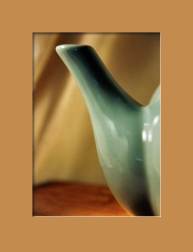
Click image for larger view
Layer->New Raster Layer. Selections->Load from Alpha Channel. Effects->3D Effects->Cutout. Offsets are -1, Opacity 100, Blur 3, set the Shadow Color to white.
Layer->New Raster Layer. Effects->3D Effects->Cutout. Offsets are 3, Opacity 100, Blur 7, set the Shadow Color to black.
Adjust the Opacity using the Opacity slider
on these two layers, the values will depend entirely upon the color underneath these layers, a darker color will require more opacity than a lighter color.
This should work on most images. Some exceptions I can think of...
- An image where a blue sky is present, even if this is the second most prevalent color, you generally do not want to mat in blue unless the image is of nothing BUT sky.
- B&W images should be matted in black, white or a shade of grey.
- An image where there are only two colors. You may want to mat in one color or the other, try lightening or desaturating these colors.
- An image that is essentially monochrome. Try matting it in the same color as the image, if this doesn't work, try using the color's complement (red/green, blue/orange, yellow/violet).
- If the second most prevalent color is a large mass near one edge, you may want to look for the third most prevalent color since using the second color can make it look like that portion of the image is "falling off" into the mat.
- If all else fails, a solid white or solid black mat is almost never "wrong".